Monday 14 December 2009

Tom's Evaluation.

1. In what ways does your media product use, develop or challenge forms and conventions of real media products?

Our music video was a representation of a typical folk song. Our artist was “Bassboosa”, and the song was a cover of “Wicked Game”. The typical conventions of a folk video are a love-heartbreak narrative. A performance going on throughout the duration of the video; with close ups of the main characters. For our video we decided to keep the same conventions but modify them a bit, and make our entire product abstract. We analysed the original video and some others like it and then compile our results and work out our plan from them. We wanted to challenge the typical conventions of a folk music video, to make our one ‘stand out from the crowd’. One of our original ideas was to have lots of shots of ambient things; such as sky and street shots. We then thought that we could fast forward these, this then played with the idea of time. Most folk music videos have a limited number of shots throughout the duration of the video. This was one of the things that we thought it would be best to stick with. If we did not then our video would be completely of topic. Rap/hip-hop music videos have lots of shots; we did not want our music video to be associated with them. In doing a love based narrative and putting a twist on it by making it abstract, we had quite a limited amount of effects we could use when editing. But the one that we did use when manipulating time, was the green screen. Most music videos do not use this effect, so this was challenging the forms and conventions of real media products. In doing so this made our music video stand out from others. Although the person watching the video could associate our video with others of the same genre it could also be seen as one that is unique in its own way.


2. How effective is the combination of your main product and ancillary texts?

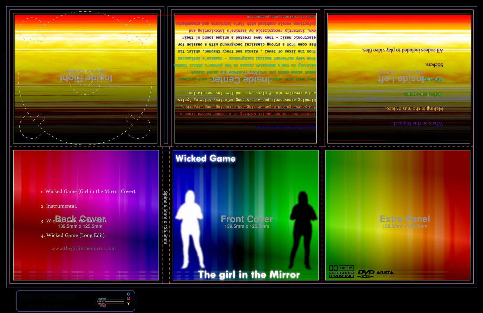
For our ancillary products we had to product a magazine advert and a digipack. Originally we decided to product our products as a team/group effort but we ended up producing them separately. The combination of our main product and the ancillary texts worked quite well together. We used a screenshot of Danni from the main product and then placed it onto the Digipack/magazine advert. To do this we had to get rid of the surroundings around Danni, and then we made her a solid colour. We then placed the same image of Danni adjacent to it. In doing so this made the two images contrast each other, playing with the essence of good and evil. This relates to the song where the lyrics say “what a wicked game to play”. This makes our combination of main and ancillary products work quite effectively. While making our digipack we got to play around with quite a lot of the effects that were on offer to us. For the title and the image of Danni, we used a few blur and glow effects. Making the title seem almost ‘holy’ for the good contrast.
While making our Digipack we set out to get some pictures from a ‘photo-shoot’, we set out to get some quite ambient images. After doing our ‘photo-shoot’ we then came to the conclusion that they would not work quite as well as we originally planned. With the lack of time we had we could not get images that were substantially relevant.
Throughout our two ancillary texts we used the same font and colour scheme. We wanted the buyer to be able to recognise and associate the main product with the ancillary texts. In doing so, we used the same picture of Danni alongside the same image from the Digipack on the magazine advert.
Most typical Folk DVD’s feature sepia-like covers; the rest of the DVD is quite plain and ‘laidback’. We wanted to keep some of these features on our products. So we made all but one of the panels (the one with the biography), quite empty. Those panels featured a URL for the website and some logos.
In using vivid colours on our products, the buyer would be able to spot the DVD quite easily as it will stand out from others. If the buyer has seen the magazine advert as well then they might be able to spot it even quicker. For the vivid colour on the digipack we used Photoshop and like our music video, we tried to create something abstract and different from most products. The digipack featured a ‘Dolby Digital’ and ‘Sony’ logo on it.
On our digipack we did not place a barcode. We did this because we wanted the pack to be sealed in a plastic wrap. And on this wrap would be a barcode and security tag. When the digipack would be first released we were going to package a ‘freebee’ with it; which was going to be an online address that only buyers could access with their own unique access code.
The magazine advert had a variety of information on it including, Tour Dates, DVD Release date, the artist website, where the DVD was being sold at and some informative logos on it. The person reading the advert would be able to find enough information so that they could find and turn up at the store at an applicable date.
Editing our two products at the same time between Fireworks and Photoshop allowed us to consolidate them at the same time. Two of us were working on the products next to each other; in doing so we were able to get the same logos, images and information on each product accurately. Although we wanted our products to be abstract, we did not want them to look identical. Yet at the same time be able to be associated together.

3. What have you learnt from your audience feedback?

Due to bad planning we did not pull a rough cut together on time for our focus group discussion. But throughout the duration of our project we were constantly getting verbal feedback from our teachers and colleagues. With the feedback that we did get we were able to make our project slightly better. We tried throughout the duration of the project to keep on track without deadlines but failed due to absences.
Some of our audience feedback helped us improve our street scene; where we were playing with the essence of time.
“I think that you should try to remove some of the green surrounding Danni. Due to the nature of the song it would make it seem quite ‘tatty’ leaving the green there. The end user might feel that the editor did not care about the appearance of his product”.
Using this feedback we tried to remove as much of the green as we could with the help of one of our teachers. Due to the gradient on the green that the excess light made we found it harder to remove all of the green that was left while post processing Danni on the computer.
We also learnt that we should have done a few more close ups of the singer. Showing her emotions while singing. This would have made the song seem more ‘personal’ and close to heart.
We received some feedback on the transitions that we placed in the video. We learnt that they were “good and slow, matching the beat to the song. They start and finish at an applicable point in the song”.
A lot of folk music videos have two shots sliding up and down the screen. This is one of the limited amounts of transitions that folk videos use. From our feedback we learnt that we should use a very limited amount of transitions in the video.
Having feedback from our audience helped us learn what we should do, what worked well and what didn't. Without an audience it would have been a shot in the dark at weather it all worked well together or not.
An example of this is that, although we went off and made something very abstract that did not typically seem like a folk product. It still worked quite well and did its job.
“The product’s as a whole would not seem like a folk video etc… someone could see this digipack in a store and pick it up thinking that it’s a dance cd. They may then think that it’s aesthetically appealing and purchase it. It leaves a mysterious and spontaneous aurora surrounding the musician. If these were real products I would be eager to see what lied ahead in the future.”
This feedback helped us to recognise that people were picking up on our main goal and that it was succeeding and leaving people in thought.

4. How did you use new media technologies in the construction and research, planning and evaluation stages?

If we had to create our music video with just a camera and tripod then we would have struggled much more. We would not be able to do any editing and would have had to of shoot each scene in order that they were going to take place. New media technologies helped us to make our products stand out from others, making them unique.
Without new media technologies we would not have been able to do any kind of research. We would not have been able to have found any information on the band or there works. It would take weeks to find things out in person. But thanks to new media technologies we were able to find out about Bassboosa and have their biography on screen in less than five minutes.
The products that we used to research, plan and construct our entire project were: The internet, www.blogger.com, www.google.com, Adobe Fireworks, Adobe Photoshop, Final Cut, www.last.fm, camera and tripod, Microsoft Word and ITunes. Using all of these products together as a collection allowed us to rapidly plan and create a product.
The main new media technology that we used was www.blogger.com, it allowed us to put all of our thoughts and work into one collaborative workspace that people could read and keep track of our project on. Using Blogger we were able to leave feedback on each other’s blogs and use it as real life feedback on our project. Blogger also allowed us to put our rough and final cuts on it easily.
Using websites together we were able to do our research and planning stage quite quickly. We used YouTube/blogger and word together to plan. We watched music videos on YouTube a few times and then compiled our thoughts into word, analysed them with Goodwin’s theory and then posted our analysis on Blogger. We used blogger as a ‘virtual notebook’, posting all of our thoughts, ideas and creations on it, alongside some images and notes. We made each post easy to read, so that whoever was reading it would be able to visualise our ideas.
Creating our actual music video with Final Cut could not have been easier. It allowed us too rapidly create and piece together our ideas into a final product. There were plenty of filters and effects to use to make our video look however we wanted. Final cut is very ergonomic software to use. Once you are started, each tool and effect is very easy to get a hold of.
We also used Photoshop and Fireworks together to create our ancillary tasks. We used Fireworks to create the basic vectors and gradients and then post processed them in Photoshop, adding cloud and other effects to make the image seem bolder. We also used Photoshop to place the template, text and other parts of the Digipack and Magazine advert.
Using our project feedback and the new media technologies side by side we were able to create a good project. We had all of the tools at our disposal and it was down to our own effort as to how we used them. Without new media technologies we would not have been able to create anything near what we had made.

Friday 11 December 2009

Alicia Stocker Music Video Evaluation


In what ways does your media product use, develop or challenge forms and conventions of real media products?


Our media product develops from conventions of a real country/ folk media product because although we have the traditional slow transitions to match the song and the lead singer singing, it doesn’t conform to open landscape with the lead singer alone with a musical instrument or animal like most country/folk products do. We developed it into a narrative based around a boy and a girl in a relationship that’s having problems to match the lyrics. Another way we developed the media product was the modernised surroundings to cityscape taking basic elements of the structure of real media products, such as the sunrise at the beginning. To further the modernising we included props such as a mobile phone to have audiences relate to the way of communication between the two characters in the narrative. Also using a technical advancement in final cut we managed to manipulate time in the footage as well as the colour, using experimentation with camera angles and techniques such as using the straightforward and very country/folk head shots and establishing shots we expanded from there. Over the shoulder shots were used to focus of the mobile phone and panning shots of when the girl is walking mixed with a lower body shot of feet walking down stairs, a shot reverse shot was used when the girl was walking one way and the boy another to different destinations.

Although it could be argued that it challenges a real media product when it comes to the digipak, which is very similar to one of dance / electro with the bright colours and wacky background and not a customary country/folk with soft colours and a picture of the artist on the front. The packaging is rather sophisticated as it features bonus material and opens out more to illustrate extra information about the band .where as a typical country/folk one would be a single CD case.


How effective is the combination of your main product and ancilliary texts?


In particular i feel the digipak is very effective and would be highly buyable in a shop considering it looks similar to a dance/ electro CD case with the bright colours and the outline of a girl on the front which would draw people’s attention also the clear poster with similar information, using white font to contrast with the vivid background also draws the attention of a younger generations ranging from 15+ .

The music video relates to the younger generation due to the age of the characters and the establishment around them such as college something they can relate to. the communication device which is the mobile, not to mention the lead singer being an attractive female which will also be effective in selling as girls will either want to be like her and boys fancy her.

Together the digipak and music video would be very effective because of the abstract view in which we produced it having modern camera shots recent to the 21st century such as shot reverse shot ect. Also having a narrative most of the population can empathise with. Using a still from the music video we decided that a black and white version of the outline of Danni would be the world wide symbol used to recognise girl in the mirror- wicked game. Using the outline of Danni for the digpak shows a clear connection to the music video and ancillary.

MIKIS album release advert was an inspiration as to how we wanted ours to look with the exaggerated colours and bold captions. we based our information around that magazine advert such as , tour dates, name of the most recent song, and who was the product producer. To improve the realism of the advertisement, we included a company logo at the bottom of the page also including how you can purchase it through iTunes or HMV stores or local stores.

However i feel the our media product would work more effectively as a single enteritis because of the abstract digipak which is in contrast to the mellow sountract and easy pace of the music video they would sell better by themselves than as a joint package.


What have you learnt from your audience feedback?


What I learnt from the feedback is the music video could have been improved with shoots out of college similar to the street scene and cloudy sunrise at the beginning, using other locations with the music video would of made our narrative more realistic and believable justifying a longer relationship with different locations and clothing. The Lip syncing towards the end where Danni is standing behind the leaves could have gone better, but due to Danni smiling when miming the words we were limited with footage that emphasized the true emotions of the lyrics .

what worked well in our favour were the slow transitions which matched the pace and rhythm of our chosen song, Bassboosa – Wicked Game which we recalled Girl in the mirror – Wicked Game. Also to develop conventions of other folk/ country we included two different bits of footage which is side by side, one sliding up when the girl is walking forward and one going down when the boy walks down stairs.

The black and white street scene with our lead singer in colour was one of our better scenes and the audience liked the contrast in colour and time manipulation for the background the main focus point was our colour overlay of Danni the lead singer. The narrative in the music video focuses on a couple having difficulties which is constant throughout, it also matches the lyrics of the song wicked game by Bassboosa .

The response for the digipak showed that people liked the contrast between the colourful background and the white font because it drew their attention, first to the background and then the information, although the style of font could have been more creative it would have developed vastly from the country/fold genre which is not the look we wanted.

On the other hand people liked how the digipak was unexpected and didn’t conform to the traditional style of country/folk digipak, it made a unique impression and would, if put on sale, lure people to pick up our digipak rather than others in the country/folk section.

However it could be argued that the digipak conforms to cyber folk or electro country due to the packaging which is similar to a dance / rave category the background image s were stills taken from the original music video so audiences can see a visual connection linking the music video to the digipak.

How did you use new media technologies in the construction and research, planning and evaluation stages?


Throughout the project the internet was used to write a record of what we did every lesson and posted it on blogger.com showing our thought processes and other ideas before our final design showing things that went wrong and how our plan expanded and is then refined. In addition we used youtube.com to gather research into different music videos containing interesting transitions or unique ideas with intriguing narratives, such as Blink 182- always or Craig David – I’m walking away. Images were taken from google.com to be used in the blog journal for examples or in general. Also researching other digipak’s and advertisement that bands had to help crate our digipak, they were all similar, and wanting to be original and have something that stood out from the crowd. One thing that we did try to keep the same was, using a picture of the singer on the front of both of the products. We wanted to keep a strong connection between the layout of both the DigiPack and the Magazine advert. This way if people saw both of the products separately then they would be able to associate them with each other. Furthermore during the filming process a digital camera and tripod was used to help holding the camera still while filming. The footage was then uploaded onto an apple Mac and into final cut, which helped us cut and edit the footage to match the pace of the soundtrack which we merged with the footage. Using different tools in final cut we were able to reproduce an effective music video. Additionally Photoshop, Fireworks, Illustrator were used to manipulate images in the digipak. Taking a still imaged out of the music video and placing it into one of the programmes, manoeuvring the colours of the sunset and the lead singer Danni. The sunset is the background of the CD case and the black and white girl was inverted from a still, colour image of the lead singer. The front panels feature three logos. A Dolby digital logo, DVD Video and an arista logo are featured at the bottom of the digipak. Bassboosa is signed by Sony, which is a relevant logo to include.

Jacob Fordham's Music Video Evaluation

1. In what ways does your media product use, develop or challenge forms and conventions of real media products?

The forms and conventions of a slow country style music video are usually that of a performance of the lead singer, usually with some relation to nature or the countryside. I feel that we have challenged some of the forms and conventions of a music video because in the narrative the lead singer isn’t present, as we were trying to have it that she was singing about him having a relationship, with another women, which was the other person in the narrative. Our music video on the whole uses the forms and conventions of a real music video the look that we were trying to convey to the audience was that of a calming ambient atmosphere, I believe that most of the video has done this well, which include parts like the sky scene at the start, which links in very well with the green screening transition and then through the green screening. The green screening gave the effect that we were after which was so that the lead singer would stand out as she was in colour and the rest was in black and white. But what I feel didn’t work was the lighting when we shot the green screen, the bottom was not lit enough, therefore when we went to edit it, we struggled to delete all of the green from the background, therefore you can still slightly see some of the green, if we were to do it again I would use a different room so that the light throughout the background would be consistent, and that it was all lit the same. The next part of our video where we had the narrative, I feel could’ve been made better if we were to have had more time, as we encountered many problems when shooting our video, as we had people that were away, so we then had to re-think what we were going to have in our video, that is when we decided to add a narrative, looking back I think this was a good decision, and that it would’ve even worked with our original ideas. I feel the narrative was quite boring to watch, as nothing much really happened. This is one thing if we had more time we could’ve changed or added to, also the location was not the best as it was in college, and would’ve been better at night in the middle of a town, as they didn’t really look like they were going to meet up. But on the other hand parts of the narrative worked effectively, like the transition when Tom is walking down the stairs and Alicia is walking up the path, this works well as they are both on the screen at the same time, and it is now made clear about what is happening between the two of them. Overall I feel that it uses the forms and conventions because the transitions are slow pace, and it gives a very ambient feel, also there is a love interest going on which slightly challenges the forms and conventions of folk music, as it is mainly just the artist being filmed.
2. How effective is the combination of your main product and ancillary texts?

Our ancillary texts and our music video have a different look from each other, they were both designed to advertise and sell the song, "Wicked Game". The digipack was designed around two main factors, the genre and the lyrics. Which we felt was an abstract way that our artist could sell the song rather than a literal one, for example having a picture from the video on the front cover. These both influenced the final product. Taking these both into account, we decided to play around with different ideas for the final product. We did some research into other types of digipack and magazine adverts that other bands had. The other bands that we researched had mostly neutral colours on the front cover, which at a glance we felt they were boring; this is why we decided to make ours stand out and challenge the conventions of our genre. As a group we did this because we wanted our digipack to stand out from all of the others in that genre in the shops on the shelves, but at the same time still fit the ambient fell that we were trying to convey, I feel we have met this because, the background itself is very plain and simple but has bright colours to stand out, the top row, we have made it by cropping one pixel column of our sky scene from our music video and stretching it so that it was the width of our digipack. Then on the bottom we have made a rainbow gradient, so that it keeps to the simple but colourful image that we are trying to express. We have also got a still from our music video of Danni and one in white and another in black. This played along with the band’s name “The Girl in the Mirror”. We felt as a group that we needed to make the digi-pack and the magazine advert look similar so that if they were in a shop the audience would recognise that they were both from the same artist.

3. What have you learnt from your audience feedback?

When we got our audience feedback back we read though it, and mostly what they said I agreed with, this is what one “feedbacker” said “Really good effects over the fast moving street and the backgrounds also fit really well. Nice use of colours. Performance pieces are really good and use good effects. The narrative seems to appear a little suddenly with not much set up, slightly confusing. First phone shot is too long. Which I agree to, because we did not have time the narrative became a little bit confusing at times, therefore as a media product, it is unsuccessful, as the audience will not want to watch again if they do not understand it. Someone else commented and said “There's an obvious attempt to include effects and a manipulation of time. The soft transitions during the performance work well with the nature of the song and the focus on a love story are also appropriate.” We also agreed with this comment strongly as we tried to use time as a symbol, therefore we used fast forwarding and slowing down footage to good effect I feel, for example the sky scene at the start we fast forwarded so that it is like time is moving faster than it is. Also we fast forwarded the green screening, we did this so that the lead singer would be the focal point of the shot. I feel the feedback help our production because it made us be reassured that the use of time worked to a good effect. We also got comments from people saying that they thought it worked well with the music and that it was appropriate. The reaction to the advert and the digi-pack was mixed between people thinking that it didn’t work with the genre that our music video was, but on the other hand we had people saying it didn’t go with it but it is abstract and it would stand out on the shelves in shops therefore it worked out how we thought it would.

4. How did you use new media technologies in the construction and research, planning and evaluation stages?

Throughout the process of making the media product, the ancillary texts, research, planning and evaluation stages, there has been a wide variety of different media technologies been used, in the planning and research stage we mainly used the Internet to do a selection of different things, we started off by researching into the band that we had chosen, and also what music videos fit the same genre, and different ideas that we had that were in other music videos, we also used the Internet to present our ideas. On a website called www.blogger.com, and throughout the whole process, we recorded our ideas, tests and final pieces onto this. On the whole I found using the Internet for the research easy, as I have done this mostly all before. So there weren’t any problems that I encountered. As a group we encountered many problems with the planning stage, as throughout there were many absences due to different reasons, we had to re-think our storyboard half way through filming, as it was just not going to get done. This led to us not getting in some of the effects that we had planned and I feel this would’ve made it a better product because I would’ve been much more abstract; which include the idea that we got from blink 182’s song always, where there are three different shots but make it look like the same shot, but got three different people talking to the same person. We had also planned to zoom into Danni’s eye to then go into a different shot, if we were to do it again these would definitely be something that I would try and add to our music video. When we constructed the music video it didn’t all go according to plan. Therefore some of us had to stay behind after college as we ran out of time for construction. If we were to do it again the main thing that would need to be improved on would be that of planning our time efficiently. We also used Final Cut to edit the Evaluation, which we came across many problems that include people not coming to lesson so they did not get filmed to be in the commentary it has been overcome by hard work and the rest of the group saying more so that we still had a full length video.

Kristina Pascuzzi Music Video Evaluation

1) In what ways does your media product use, develop or challenge forms and conventions of real media products?

The song we chose was ‘Wicked Games’ by Bassboosa which is a slow, therapeutic song which we thought fitted under the genre of folk music. Bassboosa is a duet (Jasmine and Tim) who have released a couple of songs in America but they reached No.1 with the ‘Wicked Game’ cover of Chris Isaak’s original. Traditional folk music videos usually consist of the singer, a slight narrative and sometimes an instrument. Also the videos are generally filmed in a simple environment like a deserted street or plain lands because the music usually has a meaning to the artist so they want most of the audiences’ attention to be on them. The type of shots used are long shots and close ups with gradual panning. There aren’t many jolts either and this is also to maintain the audiences’ attention and rarely obvious editing. Our production is quite a contrast to this as we used a strong narrative of our singer who plays a the female lead and a love interest and also we shot most of our video in a busy street and then increased the speed of the people walking and edited in our main character over the top of this scene to emphasise her feelings of being in love and being stuck in her feelings with the rest of the world still carrying on. Also we put the background street scene in black and white and Dani (main character) in colour to again show her separation from the world. We included a few transitions like the sliding, split screen one when Alicia and Tom are walking to show both characters in different places and to help the narrative to proceed. We got the idea to include this transition from a Blink 182 song called ‘Always’. They use it horizontally though and split into three parts, it’s still as effective though. Other ones were fading transitions between shots. We were influenced by Craig David’s song ‘Walking Away’ to use the slow transitions as they work really well in his video and the song is a similar tempo to ours and so is the narrative. We tried to keep the use of transitions at a minimal to keep the audiences concentration on our narrative. We also challenged the traditional conventions with our magazine advert and digipak as the background and bold font is not what you would expect to see on a folk digipak. We did this to attract a wider audience to our music of younger people as well. However our opening shot uses conventions of our genre as it’s a shot of a sunrise. We included this as it sets the mood of the song well I think (which is feeling depressed, confused) with the heavy clouds and makes me imagine a heartbroken person gazing out a window. This was not intended though. We wanted a clear sky with a few clouds and I filmed the sunrise twice before I got this shot but we just needed the footage so it had to do. But now I think it worked quite well. I think our music video develops conventions of folk music by the strong narrative as I think it will attract a wider audience compared to quite boring, lifeless videos they usually have.


2) How effective is the combination of your main product and ancillary texts?

Overall I think the combination of our main product and ancillary texts is effective because if we were to literally be making a real music video, digipak and advert the way we have advertised and presented our music video would attract people to purchase our digipak and if not at least view our webpage. I believe this because the abstract colour of the background with black and white writing draws in attention. We also decided to use such a bright, colourful background on our digipak to help our audience associate seeing the digipak in HMV or Tescos to our video when it plays on the television or they hear it on the radio. Our general aim was to help the name of our band to be recognised and also to appeal to an audience of the younger generation or just people who have never liked the sound of folk music. The image we used for the background of our digipak is actually a still shot from our opening sunrise scene. We took the still and stretched out one of the pixels to create the image so there may also be an unconscious association made between the main product and ancillary. Also we put the same image on our magazine advert to again help create an association for the audience between our main product and ancillary. We decided to keep all information on the digipak and advert in either black or white as the background consisted of every other colour in the spectrum but it works anyway as the background stands out a lot and then the writing stands out even more. We were influenced by an advert in a magazine for Mika’s album release and from that we got our initial ideas. We used the information he included on his (release dates, name of most recent song, record company etc...) as an example of what ours should have. He also used bright colours but it is very different from ours. Also after seeing his advert we decided to put on ours where the album is available eg. HMV, Tesco, iTunes. However the combination of the two may not be so effective to an audience that likes and enjoys folk music and who appreciates the simplicity and naturalness of traditional folk videos and digipaks. They might feel that we have tainted the image of folk. And as there is no obvious imagery connection between the video and ancillary texts some people may not associate or recognise either part to the other.


3) What have you learnt from your audience feedback?

We haven’t received much feedback on our final piece but from what we have got it’s obvious that we need to plan more and to introduce the narrative gradually rather then all at once because this confuses the audience. I agree that our narrative does work well with our song but if it was introduced at a slower pace it would fit in with the tempo of the song as well which would guide the audience along. With the busy street scene when we edited Dani in using a green screen we realised that we should have given ourselves more time to practise doing this as it wasn’t as easy as we had expected. There are parts of her which are slightly transparent and there isn’t a definite outline of her body which makes it really obvious that we have edited her in and we didn’t want the look of the video to be surreal with a floating girl in the street but for her to look like she’s still in a moving street. Generally we should have started filming earlier to allow mistakes to be made and then to be overcome but like in the street scene this wasn’t able to happen. One piece of positive feedback I was pleased with was that the slow transitions fitted in well with the pace and feeling of the song because that is something we achieved on. We made a lot of changes throughout the making of our video and what we originally planned out on a storyboard didn’t end up being involved at all. Personally I think that the original idea would have worked out better overall thinking from an audience’s perspective and comparing the video we were going to create and the one which is out final piece. Still I am not quite sure why everything got changed but out group didn’t really cooperate well together so I think that affected what we could have achieved and what we did achieve with our music video.


4) How did you use new media technologies in the construction and research, planning and evaluation stages?

In the construction and research part of our task we used various types of new media technologies. All of the different search engines and websites we used obviously were only available due to the internet. We took advantage of having Google and YouTube in order to research our artist to look at previous songs they had produced and to gain pictures to put on our blog to illustrate our ideas. We used YouTube again to look at videos in the same genre as our chosen song to get an idea of what typical folk music videos were like. Also we thought of music videos which we’d seen on the television that contained interesting and effective transitions that we could copy or attempt to recreate. The website we used the most though was blogger. We used this website throughout the whole task as a sort of running commentary of what we were doing, how we were going to do it and what difficulties we faced along the way. I think Blogger much better then doing it all on paper or in a folder as it’s easier to use and easy to keep track of what’s going on. Also you can compare your own groups’ progression with others. In the planning stage and when it came to creating the footage and images we needed for our video we used Final Cut to edit video footage and to merge our video with the song to help us with timing and when to cut and we used Illustrator, Photoshop and Fireworks to do the green screen photo of Dani and to try and make that look perfect and also to manipulate still shots from our video to create another image. (Our digipak cover.) Overall we used lots of different technologies in order to create our final piece and if it wasn’t for all the software available it wouldn’t have been possible.

Thursday 3 December 2009

video commentary

video commentary should include:
  • Green screen , test footage
  • Different effects/shots - hand cam, over shoulder, fade in, slow motion
  • Deleted footage - bed scene, green screen test footage. Why we didn't have the footage and how we improved the green screen.
  • Inspired music videos and transitions used e.g Craig David - walking away with the fade in and outs. Blink 182- Always with the sliding split screen.
  • Student Feedback - good / bad for music video and digipack ( check blogger for updates)
  • Media Products used, such as internet for research, images and blogging, final cut to edit and merge footage with soundtrack , photoshop, illustrator, fireworks to manipulate images to create a certain image ect.

Friday 27 November 2009

An overview of our DigiPack

We have just finished our digipack and our magazine advert. They were both designed to advertise and sell the song, "Wicked Game". The digipack was designed around two main factors, the genre and the lyrics. These both influenced the final product. Taking these both into account, we decided to play around with different ideas for the final product. We did some research into other types of DigiPacks and magazine adverts that other bands had. We felt that they were all similar, and wanted to create something that stood out from the crowd. One thing that we did try to keep the same was, using a picture of the singer on the front of both of the products. We wanted to keep a strong connection between the layout of both the DigiPack and the Magazine advert. This way if people saw both of the products separately then they would be able to associate them with each other. E.g., if someone saw the magazine advert on a billboard, then they would be able to instantly recognise the cd in store.
The DigiPack and Magazine advert both featured an image of our main ‘character’ in the video, Danni. I placed two images of Danni on the DigiPack, one in white and another in black. This played along with the band’s name “The Girl in the Mirror”. Giving her almost two personalities, a good and a bad side. I wanted the front cover’s background of the digipack to be something quite abstract, something that would stand out from other CD’s. Due to the nature of the song being quite a simple song. I kept the other front panels quite simple, leaving the song names in the middle, evenly spaced out. Cramming to much information on the back cover of the CD seemed like a negative idea. The front panels feature three logos. A Dolby digital logo, DVD Video and an arista logo. Bassboosa is signed by Sony, so I thought this is a relevant logo to include.
Once you open up the DigiPack you start to learn more about the band, and what you benefit from buying a digipack compared to a standard CD. The inside of the digipack holds two panels of information. One with the biography of the band, and another with the bonus ‘features’.
I used the same font throughout the digipack and the same gradient on the text inside the digipack. Our digipack will be held inside a plastic wrapper. This wrapper will have the barcode stuck onto it, along with a security tag.
The magazine advert and digipack were made in Photoshop. The front cover image was made in Fireworks. Due to some green screening problems we faced during shooting the music video, Danni was slightly cut off in some areas. I had to ‘rebuild’ her in Fireworks, and smoothen her out. You cannot tell this though.
Overall, we were short on time when we made these two products. But I feel that they are both successful and do not look to ‘shabby’. I think that we met our deadlines on time, and our products get the messages across and could sell copies in store. What is most important is that the products do their job and promote the band and song.

Our Digipack and Magazine Advert

Magazine Advert:

Digipack:

Advertising for the Digipak

Here are some ideas for what we could include to increase the appeal of the single:
- Lyrics
- Limited edition status
- Live performances
- Interviews with band members
-TV advertisements
-Local gigs

Freebies:
- Stickers
- Posters
- Postcards
- Competitions
- Vouchers
- Priority tickets
- Signed stuff

Thursday 26 November 2009

Thoughts on the Music Video in general

Due to bad planning and people not attending the lessons we fell quite far behind. Once we found out the final deadlines we started to get a move on. We quickly planned out a short narrative and shot it in one lesson. Although our video was not as good as it could have been, we still included some of the conventions that a typical music video has, including lip synchronising. The editing and green screening we felt worked well, although some parts of it did not quite work. For example when Danni is singing in the street, people just walk through her, which we feel we could've made better if we had more time, or if we had planned better in advance.

The codes and conventions of a music video magazine

Codes and Conventions

The codes and conventions for music magazine adverts are;
  • Using the face of the artist to sell the product.
  • Been unusuall and different to stand out and make people remember it and want to buy it.
  • Advertise the brand name on the advert.
  • Keeping the style throughout the different products the same, consitency, so people can recognise, for example a symbol.
  • Song/Album title
  • Visual links to videos- Intertextuality
  • Condensed information on content
  • Release date
  • Artist name
  • Where is it available to purchase
  • Record label logo

font ideas


These are a few fonts we have found that match the image which our song creates. We will be using the same font from on the digipak and our magazine advert to show the connection between the two. However due to other group members the name of the band was changed to " the girl in the mirror" and not Bassboosa which is written.

Ideas for Magazine

For the background of our advert we are going to use the same picture that's the background of our digipak. This is an abstract version of the sunrise featured in the original music video, the reason its abstract is to match our abstract music video. Our magazine advertisement will also have the same font used on the digipak so people can remember and associate the digipak with our advert. Our advert it will consist of:

  • The name of our band
  • The name of our album
  • The dates of our tours
  • Our website
  • The name of our most recent songs
  • The other types of media available. Eg. itunes, DVD
  • Our record labels logos

digipack idea

We are making our CD available as part of a digipak, which means it will come with bonuses such as special features including an interview with the band, a making of music video documentary & posters of the band. It will be in the style of a unique CD style which folds from the right and overlapping from the left having the information and images on the outer casing.but when it is put into a DVD player, the interview and making of... will be able to be viewed.

 
© 2009 GROUP 15 - Music Video 2009/10. All Rights Reserved | Powered by Blogger
Design by psdvibe | Bloggerized By LawnyDesignz