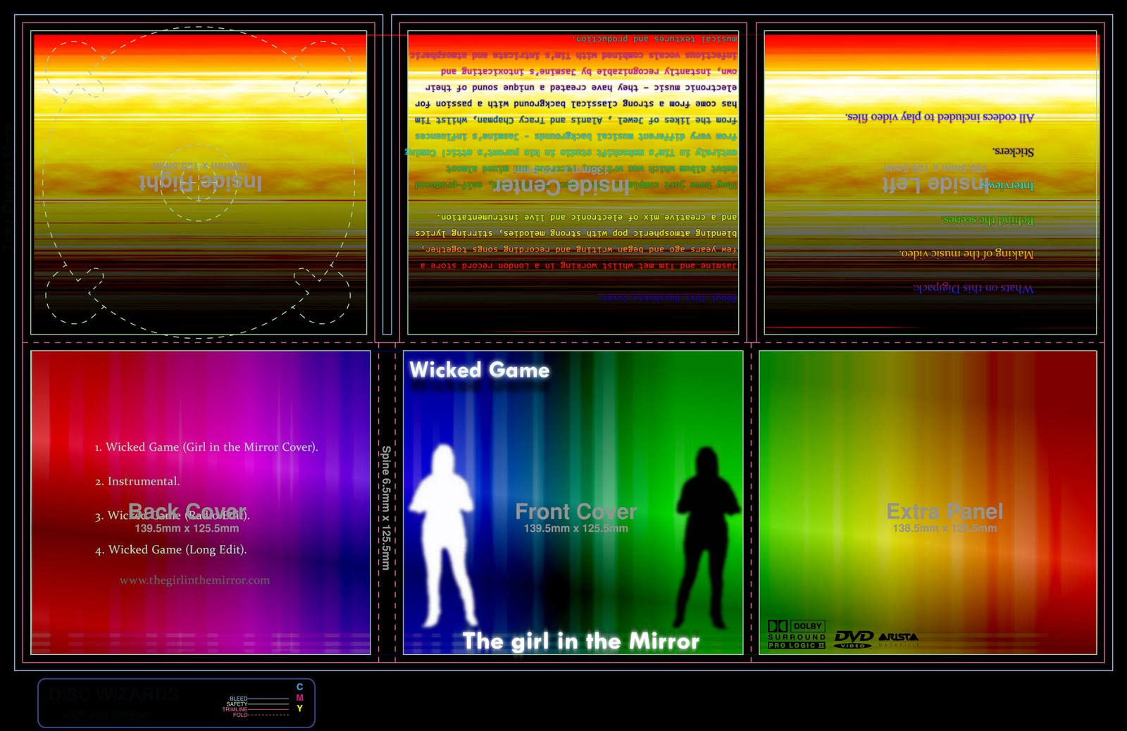
This isn't what I would have expected from the slow country ballad that's featured in the video. However, this album would stand out from others in the country section which might use more neutral, natural colours.
The bold colours seems more appropriate to an electro or dance band, but as the song is a cover version that does implement some obvious electronic production, it could be argued that it's appropriated. Perhaps it's cyber-folk - electro-country?

2 Responses to “Our Digipack and Magazine Advert”
-Plain writing looks effective on bright background
-Simple, so information stands out
-Bright colours make poster stand out
-Writing font could be more interesting
This isn't what I would have expected from the slow country ballad that's featured in the video. However, this album would stand out from others in the country section which might use more neutral, natural colours.
The bold colours seems more appropriate to an electro or dance band, but as the song is a cover version that does implement some obvious electronic production, it could be argued that it's appropriated. Perhaps it's cyber-folk - electro-country?
Leave a reply